
Start with letters that can actually hold their shape
Fine lettering needs a font with enough structure to stay in one piece after cutting. Thin strokes and tight corners can work, but only if the characters are large enough and the cutter is set up properly. For names, labels, and short phrases, a clean sans serif usually gives fewer problems than decorative scripts with loops and hairline tails. If the text must be tiny, widen the letter spacing a little and avoid squeezing everything into one line.
A good rule is to test the smallest word first, not the full artwork. Cut a few letters at the size you plan to use and check whether the centres stay open and the corners stay sharp. If the inside of an A, e, or o starts lifting when you weed, the design is already too fine for the material or the blade depth is off.
Match the vinyl to the job, not just the colour
Different vinyls behave differently under a blade. A softer film may cut quickly but lift during weeding, while a firmer film can keep edges cleaner on small text. For fine lettering, smooth material with consistent thickness usually performs better than textured film. In hotter parts of Gauteng, leave the roll to settle indoors before use so it is not curling from the heat when you load it.
Keep the backing clean and dry. Dust from workshop floors in Kya Sand or a bit of humidity from a coastal delivery can change how the film feeds through the machine. If the liner has picked up grit, tiny letters may start dragging, and then you get jagged corners or partial cuts. A simple wipe and a quick visual check saves a lot of rework.
Use blade depth and pressure as fine controls
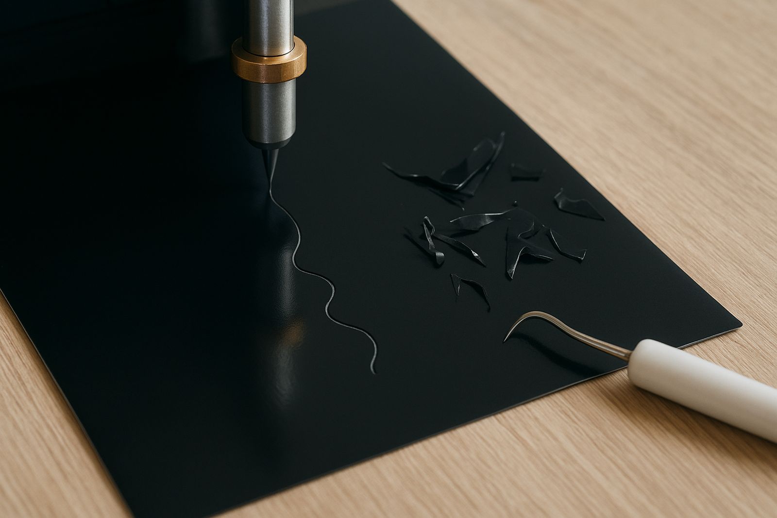
When small text is lifting, the instinct is often to push more pressure through the cutter. That usually makes the problem worse. Too much pressure can score the backing paper and leave the inner parts of letters ragged. Start with the lightest setting that gives a full cut, then increase in small steps until the weed pulls free cleanly. The blade should kiss through the top layer only, not carve the liner underneath.
Do a short test strip before every new roll or job. If the blade is too deep, the tiny bridges in letters like A, R, and 8 will tear. If it is too shallow, corners may remain attached and force you to pull too hard during weeding. That tugging is what causes fine strokes to curl or lift off. A careful setup takes a few minutes, but it is faster than remaking a batch of labels.
Reduce lift by changing the cut path and spacing
Small fonts often fail where strokes meet, not in the middle of the letter. Where possible, increase the tracking between characters a touch and avoid over-compressing script text. If the cutter is set to trim too quickly around tight curves, the blade may twist and leave tiny nicks that become lifting points. Slower cutting on detailed work is worth it.
For single colour decals, think about the direction of weed lines as well. Cut the job so the easiest weed path runs through open spaces first. This helps especially on narrow words, where a bad pull can take out an entire letter. In one Randburg shop, a set of 18 mm service labels kept lifting on the tails of the letters until the design was opened up by just a few millimetres. The job went from frustrating to manageable, and the client got clean labels for a row of stock bins.
Weeding fine fonts needs patience and the right light
Good weeding starts before the hook touches the vinyl. Use bright side lighting so the cut lines show clearly and the blade marks are visible. A pair of tweezers or a fine hook helps with tiny centres, but the main trick is to lift slowly and keep tension even. If one part of a letter resists, stop and trim it rather than pulling harder.
Work in short lengths when the design is very small. Long weed pulls can snap thin strokes or curl the vinyl back onto itself. If the text is for apparel, weed on a flat surface and keep the cut away from fans or open windows. Moving air can lift loose pieces and stick them to the wrong part of the design, which is a pain to fix once you are halfway through.
- Lift the scrap at a low angle, not straight up.
- Keep a sharp blade on hand for detailed jobs.
- Replace worn cutting strips before they start marking tiny letters.
- Store spare vinyl flat so the edges do not curl.
Check heat transfer settings before pressing small wording
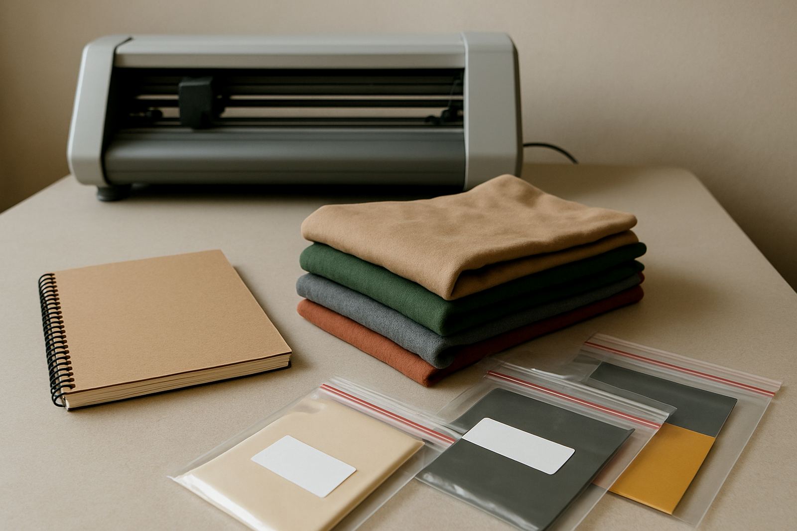
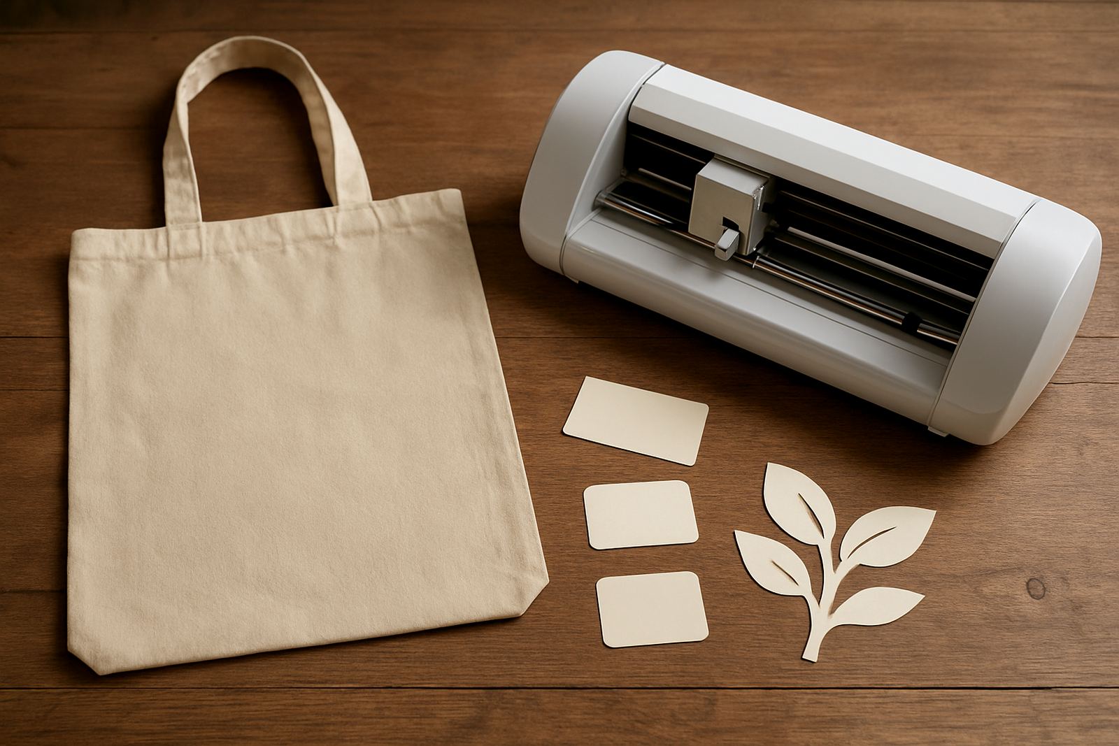
Small lettering on shirts and bags needs a careful press, because heat and pressure can flatten fine detail if the setup is wrong. Test the press temperature, dwell time and pressure on a spare piece before doing the full batch. If the lettering is lifting after transfer, it may be that the press is too cool, the pressure is uneven, or the garment surface is textured. Cotton T shirts behave differently from poly blends, so do not use the same setting for everything.
After pressing, let the film cool as instructed for that material before peeling the carrier. Rushing this step can pull up thin strokes and leave the job half done. If the design includes very small words, rub them down with a silicone sheet for a few seconds after the first press. That extra finishing pass can help the edges settle into the fabric better.
A practical test routine saves time on repeat jobs
Repeat work is where clean cut lettering pays off. Once you find a setting that works, write it down for that machine, that blade, and that film. Keep notes for common sizes such as 10 mm labels, 15 mm names, or 25 mm service wording. If a customer in Pretoria East wants the same text cut every month for uniforms or packaging, a stable setup means fewer do overs and less material waste.
In our workshop, we always tell users to test the first metre of a new roll before running a full sheet. That small step shows whether the cutter needs blade calibration, whether the material feeds evenly, and whether the text will hold on the backing. Get those right and even fine text can come out neat and readable, every time.