Start With the Shirt, Not the Artwork
Before you open a file or cut vinyl, look at the garment itself. A small toddler tee, a size medium cotton crew neck and a 4XL work shirt all need different placement. The same artwork can look neat on one shirt and awkward on another if you ignore size, neckline, seam position and how the fabric hangs.
For most chest prints, a good starting point is just left of centre on the upper chest, or centred across the chest for a bold front. Keep in mind that the shoulder seam is not your main guide. Use the neckline and the centre of the garment instead, then measure down from the highest point of the chest area. On stretchy shirts, lay the garment flat without pulling it tight or the layout will shift once it is worn.
If you are doing batches for schools, events or local clubs in Randburg or Midrand, keep a simple placement note for each size range. That saves time later and helps you repeat the same look across the order.
Chest Prints That Sit Well on the Body
Chest prints are the most common layout on shirts because they are quick to read and work well for names, logos and small graphics. A clean chest layout usually sits about 6 to 9 cm below the neckline on adult shirts, but this changes with garment shape and print size. On ladies cuts, you may need to shift the design slightly higher or narrower so it follows the shape of the shirt.
For small logos, keep the artwork compact and avoid stretching it too wide. A chest print that is too broad can feel heavy and look low, especially on lightweight tees. For text, use enough spacing between letters so the cut lines weed cleanly and the words do not blur together after heat pressing.
- Left chest works well for names, departments and small icons.
- Centre chest suits bold slogans or short phrases.
- Keep fine detail simple if the shirt will be washed often.
- Leave room under the neckline so the print does not sit too high.
In Johannesburg, where many small clothing jobs are done in batches between loadshedding interruptions, simple chest layouts are easier to keep consistent. You can cut, weed and press faster when the design is not crowded with tiny details.
Back Names and Numbers Need Breathing Room
Back layouts are common on sports shirts, teamwear and workwear. The key is balance. A name placed too high can clash with the collar, while a number that sits too low can look lost above the hem. A standard back name is usually placed near the upper third of the shirt, with the number or main graphic below it where there is enough open space.
For shirt backs, measure from the collar down and from side seam to side seam before you decide on size. If the shirt has a yoke or panel lines, check that your design does not cross a seam in a way that makes pressing difficult. On polyester blends and other light fabrics, this matters even more because heat and pressure can show the seam line through the transfer.
Here is a simple way to keep back layouts tidy:
- Keep names centred over the shoulder blades.
- Allow clear space above the number or icon.
- Use a larger size for adult shirts and scale down for youth sizes.
- Check the shirt on a hanger first if the fabric curls at the hem.
For a soccer team in Pretoria East, for example, you might place the surname high enough to read from the stands, then position the number lower so it remains visible when the player moves. That same logic works for school clubs and community events too.
Sleeve Details Work Best When They Stay Small
Sleeve prints are useful for sponsor names, initials, dates and short marks of identity. Because the sleeve area is narrow, the safest option is to keep the artwork short and simple. A long line of text can twist around the arm and become hard to read once the shirt is worn.
One common mistake is placing sleeve artwork too close to the underarm seam. That area folds when the arm moves, so the print can crack, peel or feel stiff against the body. Instead, work on the outer part of the sleeve and keep the layout flat when measuring. If the shirt has a cuff, leave enough room for the finish so the design does not fight the seam.
Small logos, job titles and short web addresses often work better on sleeves than long slogans. When the design is compact it also presses more evenly, which is helpful on humid coastal days and on shirts that must still look neat after repeated washing.
Measure Once, Then Test on One Shirt
Even a simple shirt layout should be checked on a sample before you run a full batch. A test shirt helps you spot problems with scale, alignment and pressing temperature before you waste material. This is especially useful if you are working with different fabric types, from 100 percent cotton to cotton-rich blends and performance wear.
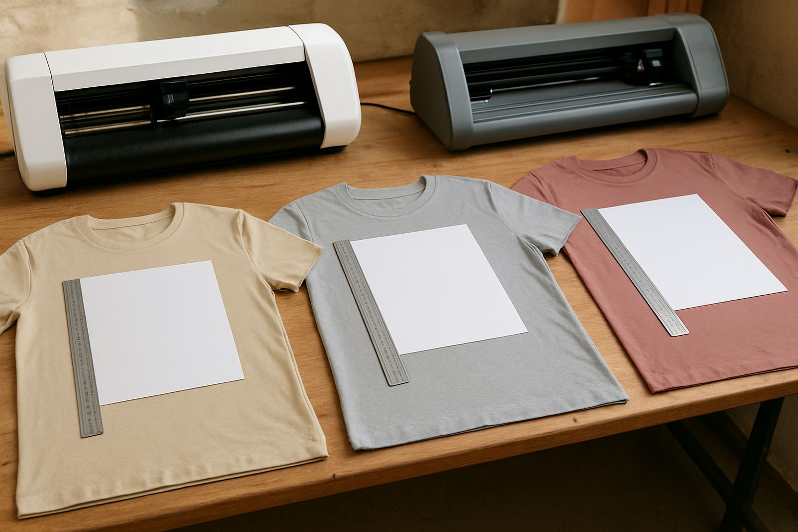
Place the shirt flat on a table and mark the centre line lightly with a ruler or fold crease. Then use a measuring guide to check the distance from neckline, shoulder and side seams. If you are printing several sizes, test the smallest and the largest first. The difference between a youth medium and an adult 2XL can be more than people expect, so one setting does not always suit every shirt.
- Test on the same fabric type you will use for the order.
- Press one sample and check how it feels after cooling.
- Wash test if the shirts are for long term use.
- Adjust size before cutting the rest of the job.
This approach saves time in a busy workshop, and it avoids unhappy calls from clients in Roodepoort or Sandton asking why the logo looks too high on one size and too low on another.
Keep a Simple Layout Guide for Repeat Orders
Once you find a shirt layout that works, write it down. A simple record of chest height, back name position, sleeve placement and artwork size makes future jobs much easier. You do not need a complicated system. A basic note with shirt type, size range, measured placement and press settings is enough to keep your work consistent.
This is useful for local sports clubs, small retailers and community projects that reorder through the year. A school in Kya Sand may want the same shirt layout each term, while a small brand in Sandton may need the same chest logo across several colourways. Clear notes also help when someone different in the workshop has to finish the job.
When your layout stays simple, production moves faster and the shirts look more balanced. That means fewer re-cuts, less wasted vinyl and cleaner results for your customer. It is practical work, not guesswork, and that is what gives a shirt a proper finish.